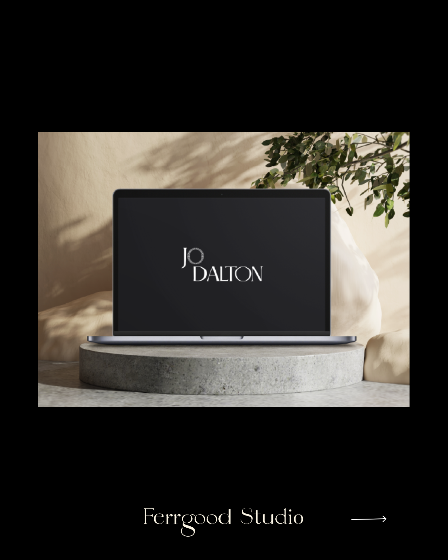
Designing with intention: How we crafted Jo Dalton’s award-winning brand identity


When Jo Dalton came to us, she wasn’t just looking for a brand refresh, she was looking to carve out space for her voice, her story, and her mission in a crowded space. It wasn’t about chasing trends. It was about creating a brand world that was intelligent, elegant, and entirely her.
Now, that work has been recognised by DesignRush as one of the Best Print Designs, and we’re honestly over the moon. So here’s a behind-the-scenes look at the project: how we approached it, what we learned, and why it means so much.
The Brief: elevating presence, without losing personality
Jo is the founder of JD&Co, a people-first talent advisory that supports high-growth startups, founders and VC funds. She’s a powerful connector, mentor, investor and advocate for female leadership. But her existing brand identity didn’t reflect that. It felt generic, outdated, and not quite aligned with the clarity and depth of what she was offering.
She wanted something elevated but still warm. Polished but approachable. A brand that could hold space for both her personal voice and the work she was doing.
This wasn’t just about logos or colour palettes, it was about storytelling. We needed to dig deep.
Our approach: start with strategy, end with story
As with all our branding projects, we kicked things off with strategy. This stage is where we get under the skin of the brand, asking questions like:
Who is this for?
What’s the change they’re trying to make?
How do we want people to feel?
What should we never sound like?
With Jo, we also did an intentional values mapping exercise, identifying the core beliefs behind the brand and where her voice fits in the wider landscape of leadership and talent.
From there, we defined a visual direction rooted in confidence, clarity and calm. Jo’s brand wasn’t about noise or flash. It was about showing up with purpose, grounded in years of experience.
Crafting the visual identity: elegance with edge
We knew the visual identity had to balance two things: timelessness and distinction. It couldn’t just blend in, it needed to quietly stand out.
Here’s how we did that:
✦ Typography
We selected a custom type pairing that nodded to editorial design, classic, but with character. The headline font had sharp edges and presence, while the body font added softness and readability.
✦ Colour
We chose a muted, confident palette, warm neutrals with a hit of dark forest green. A palette that communicates authority, but with heart.
✦ Iconography
Rather than generic corporate symbols, we created a subtle monogram that was based on the logo element of the O which represented light and energy, something really aligned with Jo’s personality. This element helped us build consistency across platforms and created visual recognition, without overpowering the message.
✦ Layouts & templates
For social media and pitch decks, we built out versatile templates, giving Jo and her team the tools to maintain the brand without design bottlenecks. The goal was to make storytelling easier and better.
Bridging personal & business: one Ecosystem, two Voices
This was one of the most interesting challenges of the project. Jo Dalton is JD&Co in many ways, but she’s also her own brand. We needed to create two identities that felt like part of the same universe, while still allowing them to speak slightly different languages.
So we built a visual system that allowed for flexibility:
Shared typography and visual tone between the two brands
A slightly warmer colour palette and tone of voice for Jo’s personal brand
More structured and corporate tone for JD&Co materials
Now, when Jo speaks at events, posts on social, or publishes thought leadership, it all feels cohesive. One story, told from two perspectives.
Print collateral: where strategy meets texture
The print component, the one that got featured by DesignRush, was a joy to create. We designed the business cards in a waythat felt like mini art objects.
Print still matters, especially in the world of leadership and consulting. It's that extra touch of care and elevation, that signals you're intentional about every interaction.
Results: recognition, alignment, and real connection
The DesignRush feature was the cherry on top. It’s always incredible to be recognised by the industry, but what really matters to us is the impact it’s had on Jo’s storytelling and clarity.
Why we’re proud of this work
Because this isn’t just design, it’s transformation. It’s watching someone fully step into their voice, with a brand that supports and elevates them.
It’s also a reminder of why strategy matters. When you lead with values, design becomes more than just “how it looks”, it becomes a tool for connection, growth and leadership.
Branding that grows with you
Great branding doesn’t freeze you in place. It creates a foundation you can grow from. What we built with Jo Dalton and JD&Co is just the beginning, and we’re so excited to see how it evolves.
If you’re thinking about a rebrand, or building a personal brand alongside a business one, take this as your sign. Start with the strategy. Design from the inside out. And don’t be afraid to take up space.
Big love to Jo for trusting us with this project, and to the DesignRush team for spotlighting the work.
You can see the full feature here.